
As we’ve mentioned in previous posts, we prioritize redundancy onboard and never rely on just one chart, GPS receiver, or chart plotter. Over time, however, we’ve noticed a concerning trend: the quality and reliability of digital apps and cartography seem to be deteriorating. This is happening at a time when paper charts are becoming increasingly scarce, which adds to our concerns
Snow Bear is outfitted with high-end Raymarine Axiom plotters—one at the chart table and the other in the cockpit. These plotters are seamlessly integrated with our instrumentation, sensors, autopilot, radar, and AIS, ensuring a fully connected data rich navigation system.
All of this data is transmitted over an onboard wireless network, allowing us to connect iPads (and iPhones) running secondary navigation plotters for added flexibility and redundancy.
When it comes to navigation, the most critical piece of data is our position. For that, we rely on the boat’s dedicated GPS sensors, which provide real-time accuracy, rather than depending on a device GPS, such as the iPad’s built-in sensor, which we’ve found to have noticeable latency.
Is it the Tech?
A couple of years ago TimeZero iBoat and iSailor were both excellent solutions with strong reputations in the market, offering high-quality, regularly updated cartography. Unfortunately, in the wake of market mergers and acquisitions, everything has changed.
TZ iBoat, which once provided reliable C-Map cartography, now delivers subpar, homegrown charts that are riddled with errors and omissions. Meanwhile, iSailor was divested to a Russian company and support is non existent, leaving users in the lurch. Access to the chart store has become unreliable, and it seems that regular chart updates are no longer being provided.
Raymarine’s once promising Lighthouse charts are falling short in both quality and geographical coverage. While bundling large regions together offers good value, the updates are taking far too long to download and maintain.
Navionics and C-Map just don’t seem to grasp the convenience of the digital age. Why on earth should I still receive a physical product—a tiny SD card in plastic packaging—when modern technology makes digital subscriptions a far more efficient option? It’s absurd that I have to find a retailer, provide a shipping address, wait for the card to be mailed, and then, once it finally arrives, the first thing I have to do is update it—by downloading the entire product again.
Or is it the Charts?
Now, enough about the tech—let’s focus on the real issue: the cartography itself. Specifically, the level of detail (or lack thereof), the layout, and how accurately it reflects our position. To illustrate, I’ll use St. Lawrence, NL Harbour, where we’re currently waiting out a winter storm.
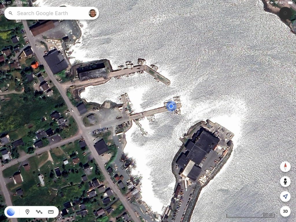
Google Earth
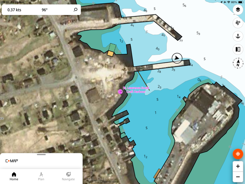
We now use Google Earth all the time to plan our arrival into harbours, marinas and anchorages as it tends to be the most accurate depiction of the location and allows us to have a look around at the land features and topography. GPS position will be from the IPads IOS and in this location it’s pretty accurate, maybe just couple of meters from the devices actual position. Taking a proper eyes-on look around this morning this is indeed the current layout for the harbour and its buildings.
Ok, this is not a chart plotter and we don’t suggest you use this for Navigation but remember this image.
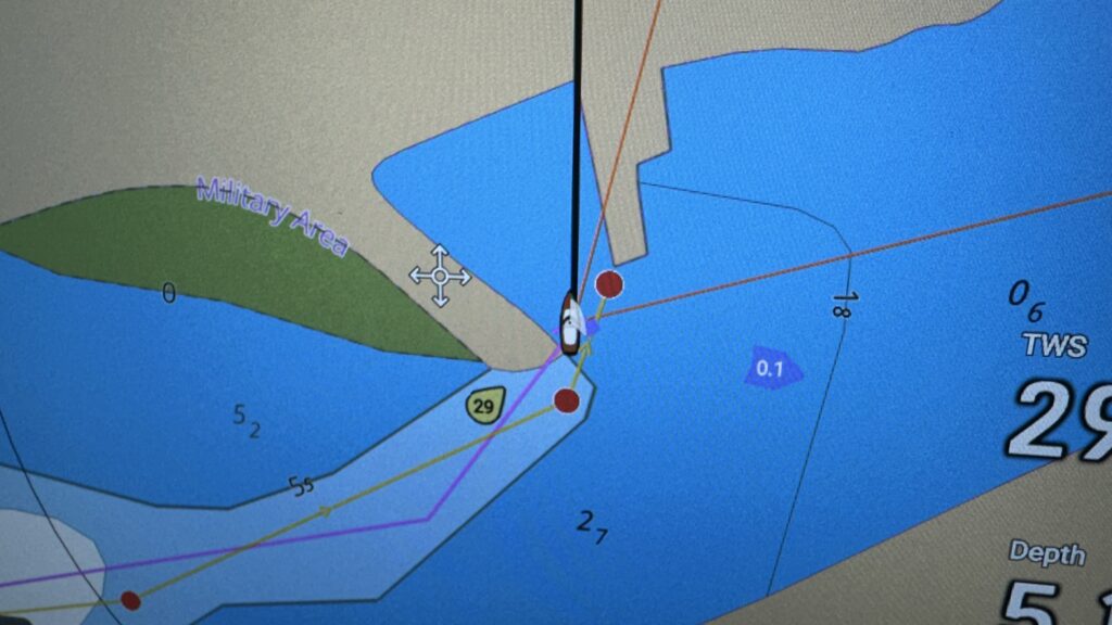
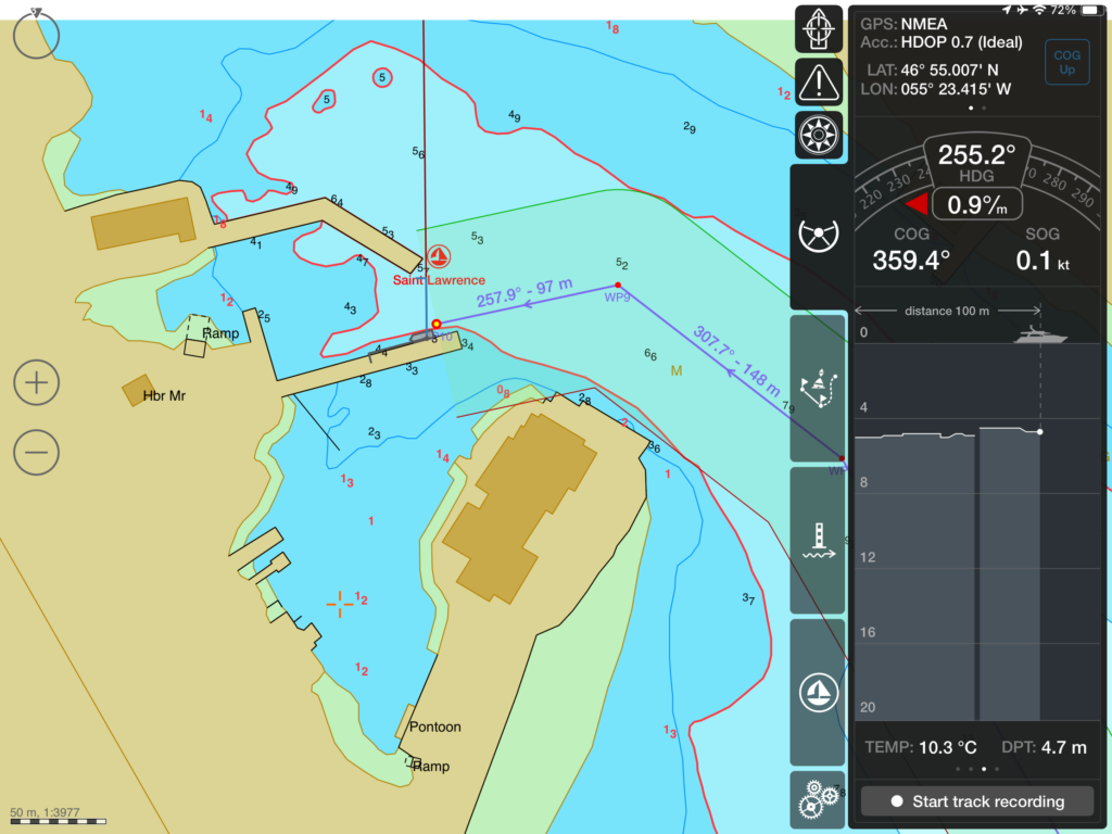
Lighthouse Charts on Axiom Display
So this is our primary navigation tool that cost a small fortune. GPS here is from the boats sensor so will be super accurate. This Lighthouse chart has a significant misalignment or georeferencing error and clearly has missing detail. This is not an incorrect setting – it’s just not in the chart for this location. The soundings are nothing like reality. We are in about 7 meters of water and our track looks like we hit the dock, which at least this time we didn’t😀.
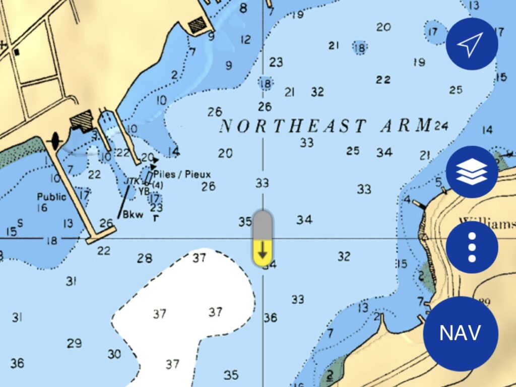
Navionics Chart and IPad app
GPS in this case will be from the IPads IOS. As we are stationary this is pretty good and our position is accurately depicted on the chart, soundings are also accurate, I can connect this app to NMEA over WiFi and have managed to display depth and get it to use the real time GPS position but the functionality is quite limited compared with TimeZero, we have found it’s also a little unreliable.
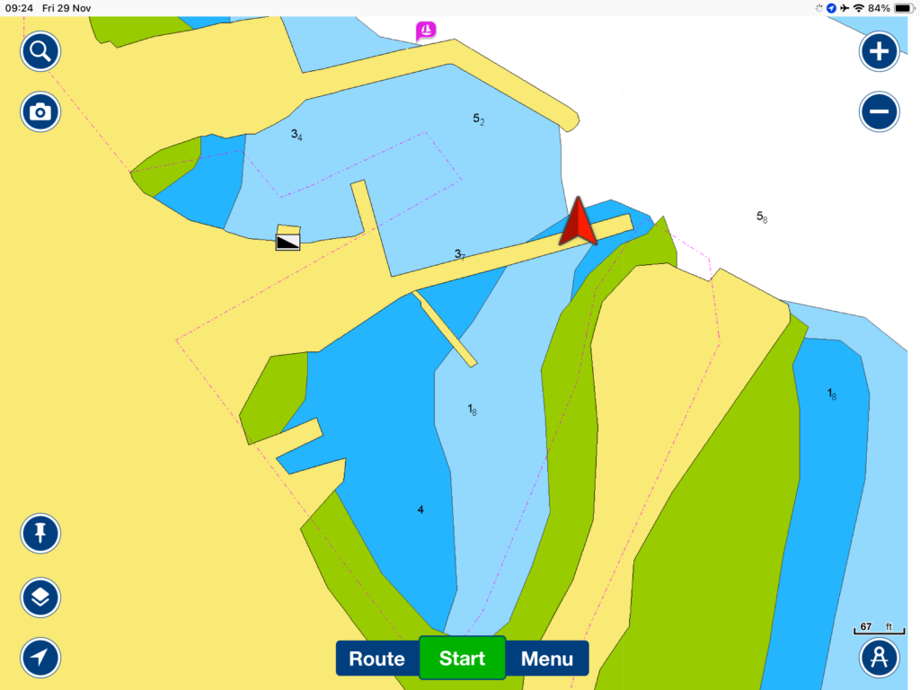
In our opinion one of the biggest drawbacks of Navionics (and Lighthouse) is the overly simplified presentation of their vector charts, which have had nearly 90% of the details you’d find on a paper chart removed. Just compare these with the more detailed raster chart shown below!
TimeZero IBoat IPad app
This app has by far the best user interface and features including advanced NMEA data and weather integration. And its chart packages include both raster and vector charts for most regions that are covered. The GPS will be from the boats sensor.
Unfortunately the vector chart layer is misaligned or incorrectly georeferenced putting the boat around 50 meters away from where we actually are.
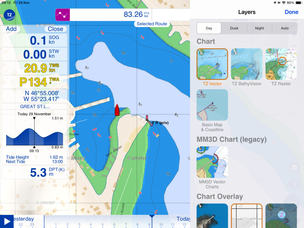
But switching to the Raster Layer we are correctly positioned. The detail here is what you would expect to have in a harbour like this.
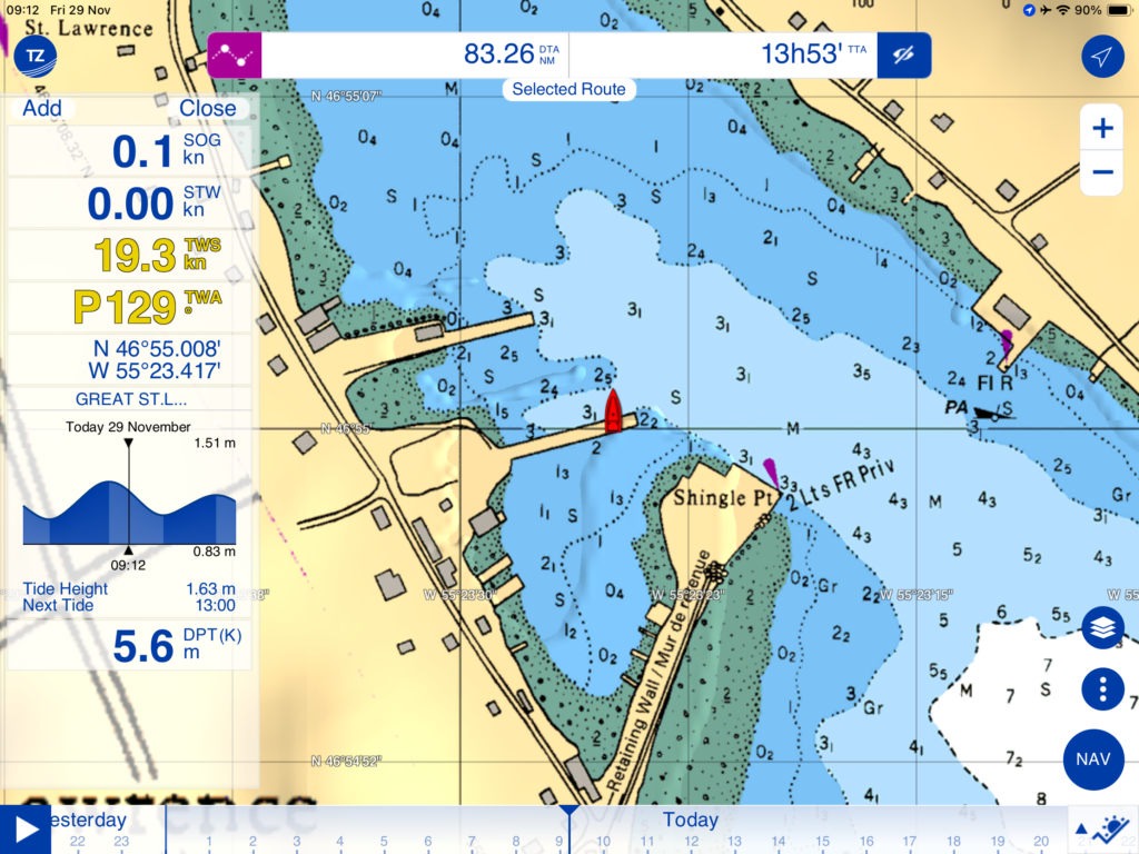
You can see the clear visualisation of our boats NMEA data and the tide in the customisable slide out panel giving all the information you need when entering a harbour.
Sadly we are seriously lacking confidence in the vector charts. The above is just one of many examples we have had to raise support tickets for: Sometimes the errors get fixed and sometimes they don’t.
If you do use the Raster Charts in Timezero you need to use caution! We are just planning a crossing to Nova Scotia and notice that the chart for one of the potential arrival harbours (Louisbourg) has soundings in Feet whereas the others are in Meters!
ISailor IPad app
Like the Timezero product, this app has NMEA data integration and is rich with features. However we find that the user interface is far too busy, the font sizes are too small and the information is spread across multiple screens. The bigger issue as already mentioned: It’s lacking support so could have a very limited life. But the chart library, when you can access it is extensive.
This chart is perhaps the most accurate and clean depiction of the harbour. We are positioned correctly and the soundings look very accurate.
C-Map iPad app
We use this app to visualise the C-Map global chart library but it does also work as a basic chart plotter. Sadly though it has no NMEA integration, limited chart download capabilities and the least intuitive user interface: Touching the display anywhere triggers the start of creating a route, so you can imagine what happens if it’s raining!
There is also a very dangerous power saving setting in the app to reduce the sampling of the GPS. Why would anyone want to reduce the accuracy and increase the latency of their position?
The quality of the chart is what you would expect from C-Map: It’s a good representation of the harbour and accurate soundings.
In Conclusion
While the various tech companies in this space continue to buy bits of each other, the market situation is unlikely to change in the short term. Our approach and advice is to never rely on a single source of information, or a single device to view that information. It’s also very important to continually assess and evaluate what is happening to a product you are using.
We do however need to be able to trust what our chartplotters tell us, despite the fact that most (rather absurd) displays a “not to be used for navigation” warning when they start up… errrr!! What else did we buy this thing for?
We believe that anyone who claims paper charts, taking bearings, and using leading lines and other traditional navigational aids are safer or more reliable than GPS has likely never sailed into some of the harbors we’ve entered. In thick fog, on a moonless night, with channel markers removed for the winter – then there’s no better option than following a track on a plotter. Add a dopler radar layer and it gets even better.
We could go on about the frustrating “night mode” on most of these devices, but I’ll save that rant for another time. However, here’s one example: on the Axiom Lighthouse display, night mode turns the sea black—and the default route color is also black. You can change the route colour, but can you change the default? No.
Please leave a comment, or send us a message. We would love to hear your views on this topic.
Great article.
Being on RayMarine and iPad Navionics, thinking I should test drive TimeZero again. 🙂
im very fascinated by Navoinics optional crowd-sourced map depths. have found them to be fairly reliable. one huge marina, Marina Del Ray, have a fan of tracks in all direction mostly the popular departure and arrival angles. the fan shows both sides of the coin, there is a very high density of measurements, and fairly accurate but you also see the errors in lines thats higher and lower than the reading should be.. clearly a lot of boats do not have compensation for sensor depth in the hull, on unbeknownst to the sensor its facing forward or sideways a bit changing the actual depth.
think the other big problem with most digital sources – its very hard to know where this data came from, was it signed off by Royal Danish Cartographic institute, or plainly by Bubba the shrimper.
One upside of being able to see the community contributed readings on Navionics, the density of the readings give you a good idea of the locals paths through the area.
Thanks Bo, we still think the TZ app is the best of the bunch, and before they changed the charts it was faultless, shame they couldn’t maintain a relationship with C-map even at a premium price. At one point I thought they might get there with their current charts as they were very responsive to rectifying errors and omissions, more recently they have been less responsive and tried to blame the underlying source data telling me that their competitors face the same issues despite me sending examples.. where it gets really frustrating is where the missing detail is clearly in the Raster layer . The crowd sourcing approach is interesting and works well in well travelled areas, as you point out it’s easy to rule out the anomalies, where it’s less useful is in the less frequented locations where there is no substitute for proper surveys.
Since you are in St Lawrence NL you might appreciate “The Wake” by Linden MacIntyre… fascinating & heart breaking.
Ah yes we read a little about this, Thanks for the book tip Jayne, looks like a good read.
This is timely. I just sailed in my
friends boat from Hampton to Antigua. We all complained the entire trip about this 3x Axiom plotters and the colors (esp night!!!) and lack of detail. I also just today about the fateful destruction of the Volvo Ocean Race boat 10 years ago because the navigator did not see the reef detail on his chartplotter. We have Garmin aboard Skyward and we are pretty happy with at least the formatting/display.
As I’m not a sailor, this was all virginia territory for me. However, I have some experience of civil aviation and am now wondering if pilots have similar concerns. I learned to fly with maps and charts, but I expect such are mainly redundant these days. Must ask my little brother, recently retired 777 Captain. Stay safe out there.
I was flying around Venezuela a few years back and the pilot was using Google on his IPhone😊. It’s an interesting question.. Charts have depths and things that change like sandbars that because they are under the surface are difficult to measure and visualise, current satellites can measure the height of the sea surface within a couple of centimetres, but depth resolution is at best 30Meters so the only way to accurately sound an area is with a boat and a depth transducer.. and there is very little of that anywhere in the world. Commercial shipping routes and harbours are super accurate but that’s not where we leisure users are sailing so the underlying charts that are being used to create these modern solutions are often derived from the work of Columbus, Magellan etc..
We still have a love affair with paper charts, but use C-MAP on B&G’s Vulcan 7 when at the helm. Our NMEA2000 integrates Garmin, B&G, Em-trak and Raymarine kit seamlessly so we have no complaints there.
In any case, harbour / anchorage approaches are done visually using all provided nav marks, leading lines etc with the charts being used to provide context for what we are seeing. Depth changes also tend to show on the water surface and a sharp eye on the depth sounder helps give us confidence that the charted depths are correct.
Technology is wonderful, but relying on it completely is never wise.
Thanks for the comments and we agree 100%. Although as we mentioned in the post there are times when we enter a harbour blind at night or in dense fog, and something new was when we noticed he channel markers being removed prior to winter in a harbour that is subject to ICE.. Every day we learn something new😊
I am circumnavigating from the US and now in thursday island, australia ready to jump to indonesia. i run my B&G system with both cmap and navionics, with backups of both on my tablet and phone. the tablet and phone apps have significantly more detail than the church ship in the B&G!!!
My default has become open CPN with satellite charts and sas planet with many different views. small hockey puck GPS turns the PC into a full function navigation unit which gets AiS data from my Vesper 9000 unit ( now discontinued – thanks again garmin!!)
I’ve been forewarned that c map and now be honest.In indonesia are pretty much useless, and I’m really concentrating on downloading all the MB tiles I need….
Thx, Rick on S/V Independence